

by Annabel Drynan Access Consultant and Director, Access Studio (ACA Accredited Member No. 452)
Light, contrast, clarity and calm: six design decisions that help a person living with dementia stay oriented and independent, in their own home or in a building they have never entered before. Most of them cost nothing at concept stage.
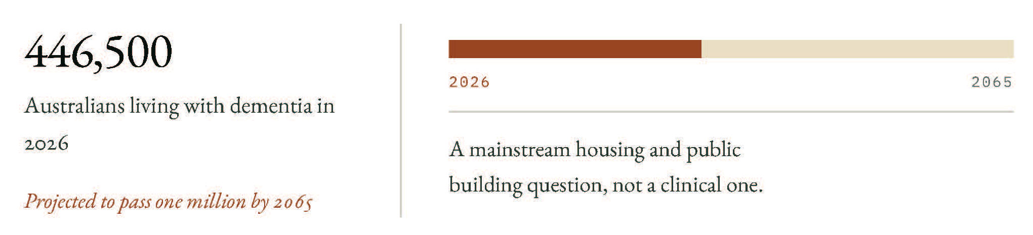
In 2026 there are an estimated 465,500 Australians living with dementia (1). That makes dementia a mainstream housing and public building question, not a specialist clinical one. It also puts it squarely in our territory: illuminance, luminance contrast, floor finishes, sightlines and acoustics are decisions access consultants influence every week, and they are the same decisions that determine whether someone can find their own bathroom at two in the morning without waking another person to help.
The building can do the remembering
Dementia is an umbrella term for a group of conditions affecting memory, thinking, perception and communication. It is caused by damage to brain cells that affects their ability to communicate with each other, and the type of cells and the regions affected define the different types of dementia. Good design has to account for all of them.
The part that matters for design is narrower than the clinical picture. Dementia can reduce a person’s ability to build a new mental map of an unfamiliar building. It can change how depth, pattern and reflection are interpreted. It can lower tolerance for glare and for background noise.
How that shows up in a building:
- Reduced short-term memory and difficulty forming new spatial maps
- Altered depth perception: dark areas appear as holes or voids
- Reduced contrast sensitivity: objects blend into their background
- Impaired executive function: multi-step tasks become overwhelming
- Heightened stress response to unfamiliar or confusing environments
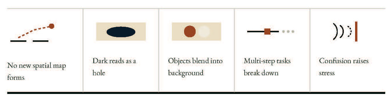
The useful response is not to add features that ask a person to learn something new. It is to remove the demand for learning altogether. A building that explains itself, where the destination is visible, the floor reads as a floor and the light is even, does the remembering on the person’s behalf.
Ask the people who will use the building
The strongest projects involve people living with dementia, and the people who support them, early and directly. Dementia Australia’s consumer engagement programs and the growing number of dementia advisory groups attached to local government make that consultation practical rather than aspirational. Design assumptions about what is confusing are frequently wrong, and they are cheapest to correct before documentation.
What is already enforceable
There is no single mandatory Australian standard for dementia design, but three instruments already set the floor:
- The National Construction Code (NCC), which sets minimum requirements for the design and construction of buildings, including the access provisions.
- The Disability (Access to Premises – Buildings) Standards 2010, and AS 1428.1 Design for access and mobility as called up by them.
- The Aged Care Quality Standards, the framework outlining core requirements for quality and safety in residential aged care.
Everything that follows sits alongside those instruments. Nothing described here conflicts with a deemed-to-satisfy solution, meaning a design that complies by following the NCC’s prescriptive provisions rather than by way of a Performance Solution.
Six design principles
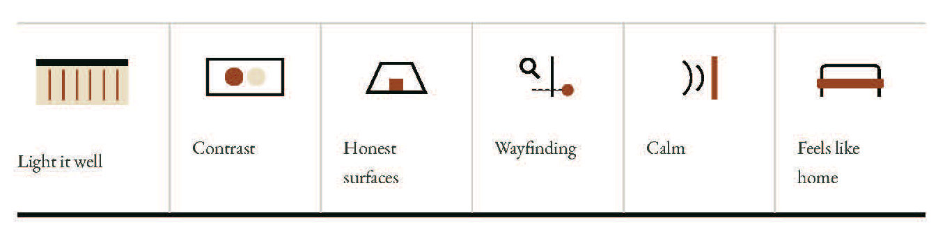
01 Light it well – bright, even, natural light without glare or hard shadows.
02 Contrast and colour – tonal contrast where it helps, calm palettes where it does not.
03 Honest surfaces – matte floors, no illusions of depth, steps or wetness.
04 Clear wayfinding – direct sightlines, landmarks, paired text and image signage.
05 Calm the senses – manage acoustics, clutter and unhelpful visual noise.
06 Feel like home – domestic furniture, personal items, secure outdoor access.
1 Light it well
Ageing eyes need considerably more light to resolve the same scene. The figure most often cited in lighting design guidance is roughly double the illuminance at seventy-five compared with twenty-five (2). Dementia does not change that arithmetic, but it does reduce a person’s capacity to compensate for a poorly lit room.
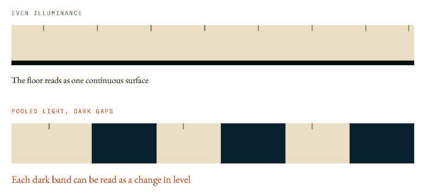
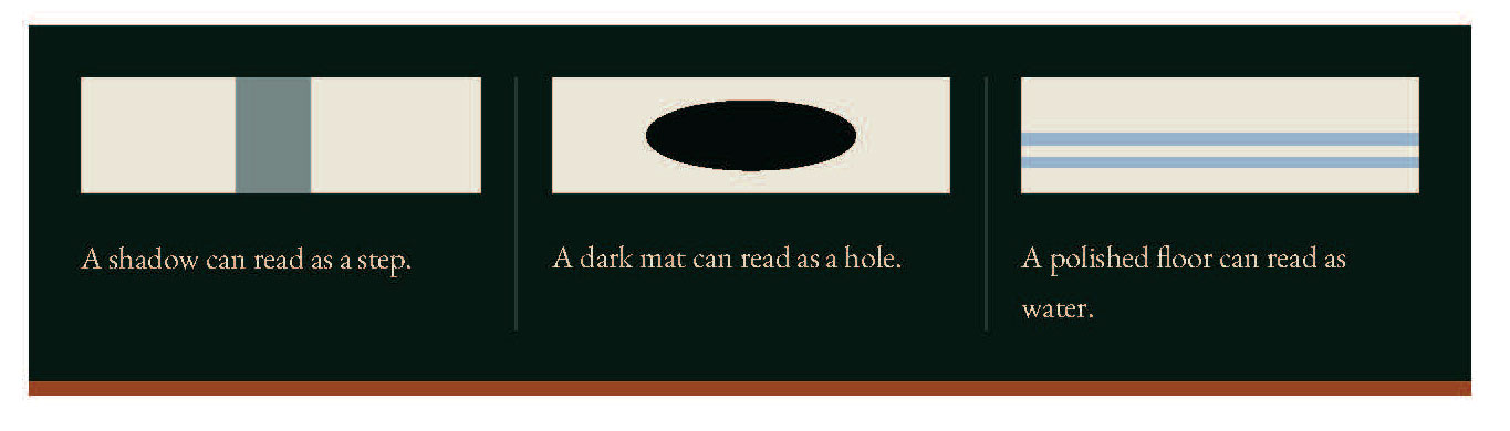
Aim for high, even light levels rather than bright pools with dark gaps between them. Maximise daylight, which supports the sleep and wake cycle and in turn reduces late afternoon agitation. Control glare from windows, polished surfaces and bare lamps, and keep hard shadows off circulation routes. A shadow falling across a corridor can be read as a step, and it will stop a person walking.
2 Contrast, used with direction
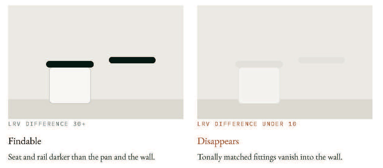
Guidance from the Dementia Services Development Centre (DSDC) at the University of Stirling and from Dementia Australia supports strong tonal contrast between key elements to improve recognition and wayfinding. The working figure in that guidance is a difference of approximately 30 points in light reflectance value (LRV) between an element and its background (3).
One clarification worth making, because the two are often conflated: an LRV difference of 30 points is dementia design guidance, and it is not the same test as the 30% minimum luminance contrast calculated under AS 1428.1 for elements such as doorways and tactile ground surface indicators (TGSIs). Meet the Standard where it applies, and use LRV difference as the design tool everywhere it does not.
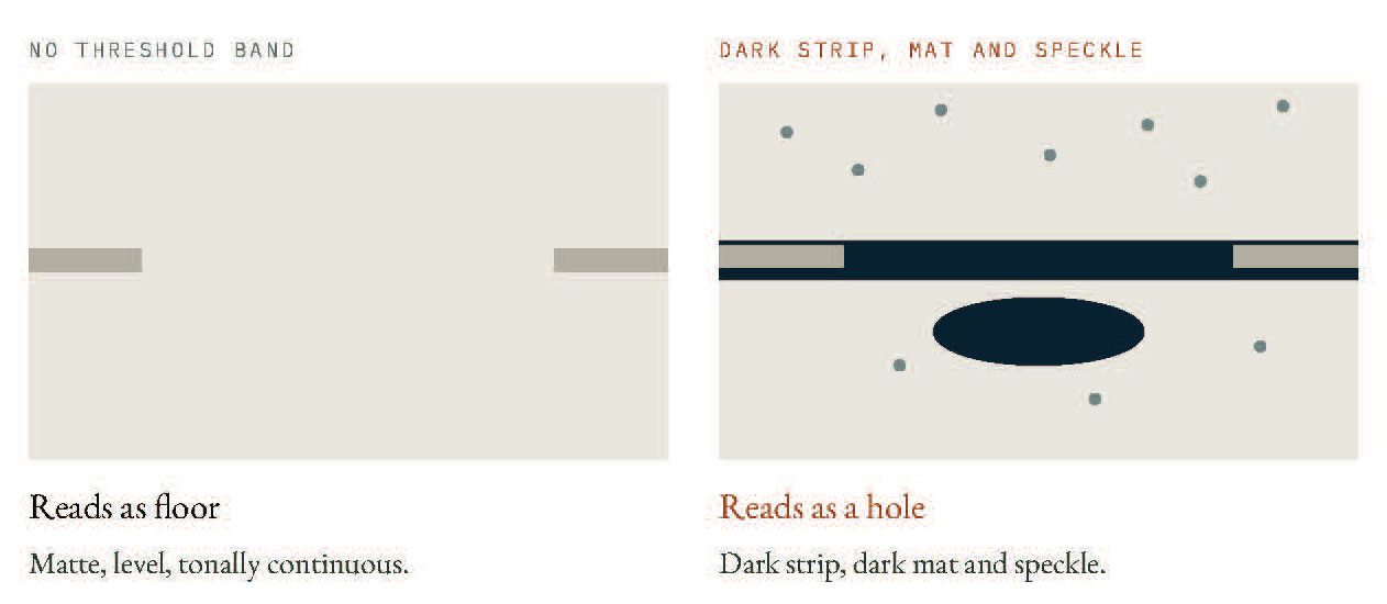
Then reverse the logic underfoot. A dark band, a dark mat, a contrasting threshold strip or a bold floor border can be read as a change in level or as a hole. People stop, step over it, or turn back. Floors and skirtings should stay tonally calm and continuous.
3 Honest surfaces
Specify matte, non-reflective floor finishes. Gloss reads as wet or icy and produces hesitation, shuffling and falls. Avoid bold patterns, speckles, sparkles and strong directional grain, which can be interpreted as objects lying on the floor or as movement underfoot. Keep transitions between rooms level and tonally consistent, and resist the drainage strip or aluminium angle that announces itself in a contrasting tone.
4 Let people see where they are going
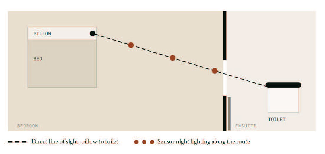
The most reliable wayfinding device is a direct line of sight to the destination. In a bedroom that means positioning the bed so the toilet, or at least the ensuite doorway, is visible from the pillow. Seeing the toilet is a better prompt than any sign.
Where signage is needed, pair a word with an image, mount it at eye level rather than above the door, and keep the total number of signs low. Distinct decor, artwork and colour by area help people tell one part of a building from another, while identical repeated corridors do the opposite. Where a door leads somewhere a person should not go unaccompanied, treat it tonally as part of the wall rather than highlighting it, and keep all required exit signage and egress provisions intact.
5 Calm, not empty
Too much sensory information is as disabling as too little. Reduce clutter, busy artwork and redundant signage, and treat reverberation: hard, echoey rooms make speech harder to follow and raise agitation. Soften alarms and call tones as far as the relevant standards allow.
Then be deliberate about the stimulation you keep. Daylight, a view out, the smell of food being prepared, a visible clock and calendar, and objects that prompt a familiar activity all do useful work.
6 Feel like home
Institutional cues carry a cost. Nurse-station aesthetics, corporate signage, hospital-grade vinyl and long undifferentiated corridors all tell a person they are somewhere unfamiliar, and unfamiliarity is the thing we are trying to design out.
Specify domestic-scale furniture, allow residents to bring their own where fire and infection control permit, and give every occupant a room they can identify as theirs by something personal at the entry rather than a room number. Keep the kitchen and laundry usable so a person can still participate in the ordinary tasks of a day. Provide direct, secure access to outdoor space, and use looping paths with no dead ends so walking never ends in a locked door and a decision.
The rooms where the day happens
KITCHENS
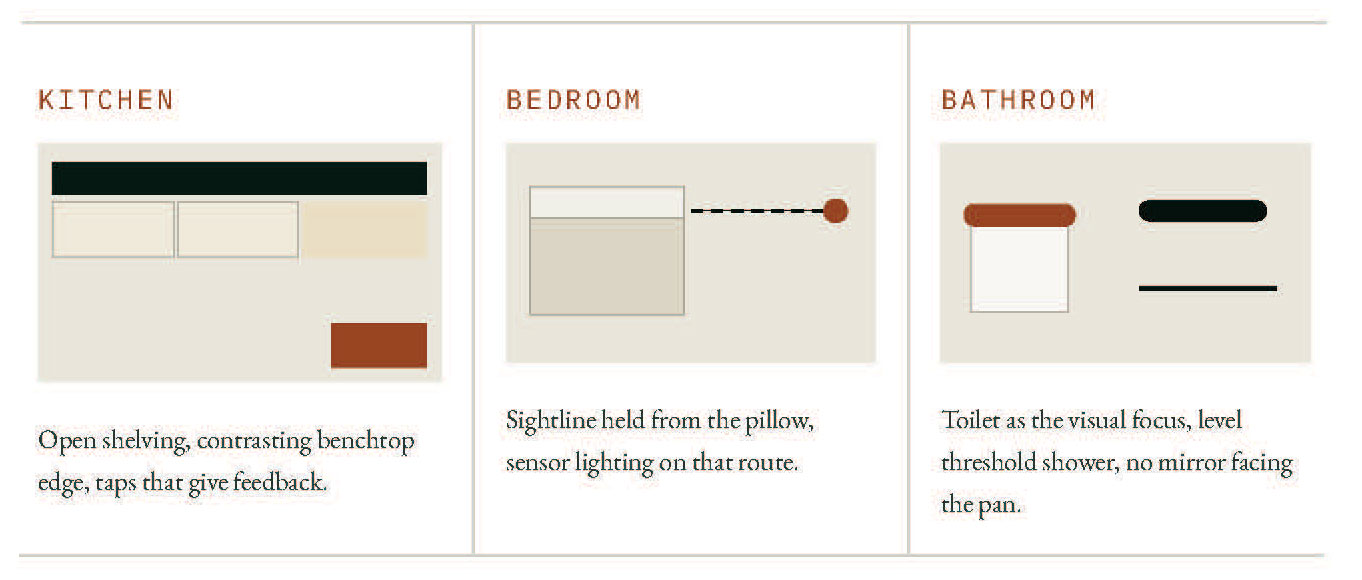
Keep the work triangle compact and the layout conventional. Use glass-fronted or open shelving so contents are visible rather than hidden behind identical doors. Contrast benchtops against cupboards and floor so edges read clearly. Choose taps and appliance controls that are clearly marked and give feedback; flush touch panels with no tactile or audible response are a poor choice here.
BEDROOMS
Sightline from pillow to toilet, gentle sensor night lighting along that route, blackout control for daytime rest, strong daylight on waking, and enough clear space for care and for mobility equipment.
BATHROOMS
The highest-risk room, and the one that earns the most attention. Make the toilet the visual focus with a contrasting seat, a floor that contrasts with the pan without going dark, contrasting grab rails, a level threshold shower, and reinforced walls now for rails added later. Avoid a mirror facing the toilet or the shower, because a reflection can be read as another person in the room.
Housing and care are different briefs
In private and social housing, the useful frame is adaptability. The NCC includes livable housing provisions for applicable dwellings, although implementation has varied between Australian jurisdictions through differing adoption dates, transition periods and state-based variations.
In residential aged care the environment becomes part of the care model. Small household clusters, short and visible routes to amenities, secure outdoor space with looping paths and no dead ends, and domestic rather than institutional fittings are all associated in the literature with reduced distress and lower reliance on restrictive practices (4).
It is cheapest at the first sketch
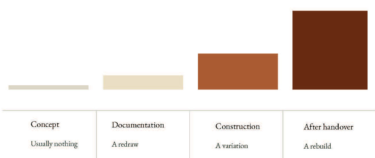
COST OF FIXING LIGHT, CONTRAST AND LEGIBILITY
OPINION, NOT CODE
Our view is that these outcomes are never successfully bolted on. Light, contrast, clarity and calm are decisions made in the initial stages of a project, and they usually cost nothing. Reversing them after handover costs a great deal.
REFERENCES
1. Dementia Australia, Dementia facts and figures, dementia.org.au (2026 prevalence estimates).
2. Illuminating Engineering Society, Lighting and the Visual Environment for Older Adults, ANSI/IES RP-28. Cited for the increase in illuminance required with age.
3. Dementia Services Development Centre, University of Stirling, Design Audit Tool; and Dementia Australia design guidance on light reflectance value differentiation.
4. Australian Government Department of Health and Aged Care, National Aged Care Design Principles and Guidelines, 2024.