 by Daniel Bedwell
Daniel Bedwell is an Accredited Access Consultant, Ordinary Committee Member with the Access Consultants Association – ACA, and Director of Obvius Access Consultants.
Luminance contrast is the difference in the light – reflective properties between two adjacent surfaces and is based on different tonal shades. Luminance contrast reflects on Light Reflectance Values (LRV). This is different to colour contrast which is based is based on hues.
Luminance contrast is not only crucial for safe navigation for people with low vision, but it has universal benefits in that it can provide clear navigation, which can assist with wayfinding. This is not only beneficial to older people but all people, as it increases our spatial awareness through our peripheral vision.
Applications
Mandatory luminance contrast under the National Construction Code – NCC 2025 relates to the following elements:
- doorways;
- WC pan;
- signage;
- stair nosing;
- lift control buttons;
- luminance contrast bands to glazing, (which is opaque, free of logos for the required width) and contrasting with the foreground surface; and
- Tactile Ground Surface Indicators – TGSIs
Also, mandatory luminance contrast under the Disability Standards for Accessible Transport applies to the following elements:
- poles and obstacles within a pathway under Part 2.5.
- handrails under Part 11.1
Further to this best practice luminance contrast would apply to the following elements:
- joinery worktops;
- door furniture;
- ceilings, walls, and floors (or skirting to highlight junctions of horizontal and vertical planes;
- lift doors;
- stair and ramp handrails;
- leading edges of doors (to contrast with the doors themselves); and
- ramp surfaces distinguished from the landings (to indicate the slope in interior spaces)
Luminance contrast to the handrails of stairs and ramps can be applied to all buildings to meet best practice and not just transport premises. See Figure 1 below:
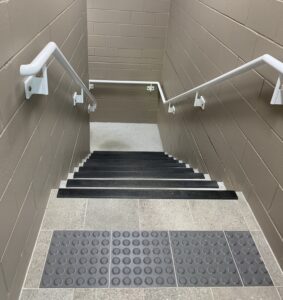
Figure 1 (Luminance contrast is provided to handrails to assist with wayfinding and safety)
Resources
Luminance contrast is based on the Bowman-Sapolinski equation using the following formula:
| Luminance Contrast = | 125 x (Y2 + Y1) |
| Y1 + Y2 + 25 |
Y1 is the LRV of the darker surface
Y2 is the LRV of the lighter surface
Online luminance contrast calculator apps are also available and can be effective when the LRVs are known from the chosen shades.
In addition, luminance contrast can be tested using equipment such as a Tristimulus colorimeter or spectrophotometer with diffuse illumination/normal viewing (d/o) geometry and CIE Standard Illuminant D65. Some access consultancies provide this service already. However, more complex testing of external elements may be undertaken by a testing organisation accredited by NATA (National Association of Testing Authorities).
Under the AS1428.1:2021 Clause 10.1 all doors are required to have a minimum luminance contrast of 30% provided between:
- door leaf and door jamb;
- door leaf and adjacent wall;
- architrave and wall;
- door leaf and architrave; or
- door jamb and adjacent wall
The minimum width of the area of luminance contrast shall be 50mm. The wording of this clause indicates that only one of these combinations is required.
As a best practice measure, luminance contrast can be applied to the leading edge of the door, so the door remains clearly visible when left open without a door closer, particularly where the door matches the wall in luminance and the architrave is concealed.
The interior layout of a space can be understood spatially and assist people in navigating the space if sufficient luminance contrast is provided between critical surfaces, such as the ceiling, walls, doors, and floors as shown in Figure 2 below:
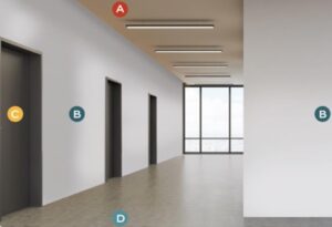
Figure 2 (Critical Surfaces: A = Ceiling, B = Walls, C =Door, D = Floor)
The luminance contrast of the ceiling is often uncluttered and can allow a person who is blind or has low vision to determine the size and layout of the space.
Other best practice requirements relate to joinery, in which luminance contrast is provided to joinery. This helps to provide prominence to vertical and horizontal surfaces and objects as shown in Figure 3 below:
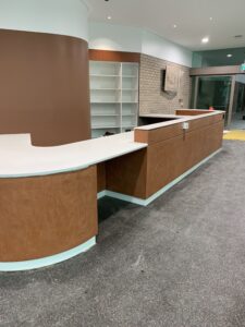
Figure 3 (Luminance contrast is provided to vertical and horizontal surfaces such as joinery including worktops and fascia panels and cabinetry – Interior Design completed by COX Architecture)
According to the Project Rainbow Research of 1997, which is a collaboration of the University of Reading and the Royal National Institute of Blind people – RNIB, colour contrast – namely luminance contrast can enhance spatial awareness and wayfinding. The project Rainbow Research of 1997 led to incorporation in the UK Building Regulations of Part M vol 1 and British Standard BS8300:2018 v2 – Design of an accessible and inclusive built environment Buildings. Code of practice.
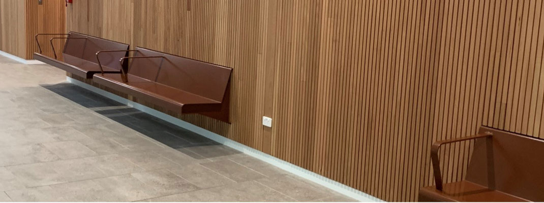
Sufficient contrast of at least 30% is required for objects, which extends beyond base supports, such as the seating shown in Figure 4 below. The luminance contrast is important in this instance, particularly when the object may not instantly be detectable by the tapping of a long cane that is used by a person who is blind or has low vision due to the gap underneath.
The wide trims such as skirting boards and tiles can also highlight the junction of the floor, wall, and ceiling to enhance legibility of shorelines, by emphasising the junction of vertical and horizontal planes.
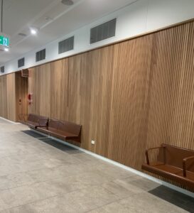
Figure 4 (Luminance contrast is provided to vertical and horizontal surfaces junctions such as skirting trims and skirting tiles and seating – Interior Design completed by COX Architecture)
The luminance of contrast of signage is mandatory under the NCC. However, luminance contrast of braille could also be considered as shown in Figure 5 below:
Figure 5 (Luminance contrast is provided to all tactile and braille characters in accordance AS1428.1, but also luminance contrast is provided to the Braille components.)
Finally, the effectiveness of the luminance contrast of these elements and critical surfaces depends on the reflectance of the materials used. High gloss or highly reflective materials can cause glare under natural or artificial lighting, reducing the effectiveness of luminance contrast. Glare and shadows can also diminish the legibility of a space. Lighting should therefore be balanced, even, and sufficient to maximise the luminance contrast. Refer to Figure 6 below:
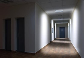
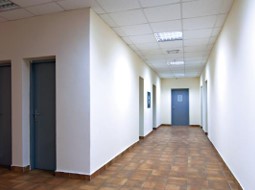
Figure 6 (Sufficient illumination to achieve luminance contrast)
Disclaimer
This article is an opinion piece which is intended solely for consideration. Best practice recommendations should never conflict with, applicable legislation, subordinate legislation, policies, and applicable Australian Standards. The author does not accept responsibility or liability for the results of any errors or omissions based on this information nor for any errors or omissions on projects.